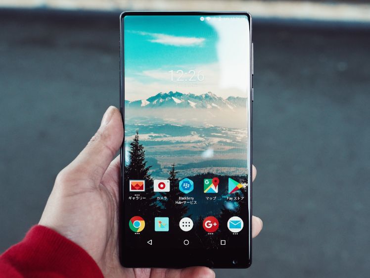
Pretty much every time I have to install an app, I end up thinking ‘I’m running out of memory’, or ‘my mobile is already cluttered with apps’.
I’m one of those people that have to try out trending apps, if not that, I’m always on the lookout for apps to help me manage my work routine; the point is that having to install apps gets pretty tiring.
Honestly speaking, most people install an app and forget all about it in a few days, the app just sits there waiting to be deleted.
Thankfully, mobile application development companies invented ‘Progressive Web Apps’. If you haven’t heard about Progressive Web Apps yet, here is what they are.
Are you looking for progressive web app developers? We can connect you with the best experts!
What Are Progressive Web Apps?
Progressive web applications are websites that look and function just like mobile applications. The reason they exist is to save users from the pain of having to install and manage apps.
They save users from having to visit the app store, find the app, download it, install it, and then use it a few times before sending it to its deathbed.
With the help of progressive web apps, users can simply open their browser on their smartphone, enter the URL and they will be directed to the PWA of their respective mobile application. Have a look at the image below:

This is the progressive web app of Instagram, you can see it looks and functions exactly like the Instagram mobile app.
Some other advantages of progressive web apps are mentioned below:
- They are very responsive
- They load instantly even without an internet connection
- Offer a good user experience
- Solves the problem of App Gap
Aliexpress, Twitter, and Forbes are some famous examples of websites that have developed some exceptional PWA’s; their web apps have aided them in improving their usability and attracting a greater audience.
Now that we’ve thoroughly understood the concept behind Progressive Web Apps, let’s take a look at how a mobile application development company can ensure an excellent User Experience in progressive web apps.
You might be interested: Progressive Web App Development to Create New Business Opportunities
#1 Optimize The Loading Time and Performance
When a user enters your web app, it shouldn’t feel like they are using the browser and they shouldn’t have to wait for the page to load.
It should load well even without an internet connection. Google has recommended that you follow the PRPL pattern to reduce issues caused by slow networks:
The PRPL Architecture:
PRPL is the pattern for structuring websites and apps that work well on smartphones and other devices; without any hindrance from unreliable network connections. PRPL stands for:
- Push critical resources for the initial URL route
- Render the initial route
- Pre-Cache the remaining routes
- Lazy-Load & create remaining routes on demand
The PRPL pattern works to improve the response time of your web app especially for first-time interactions on real-world mobile devices.
PRPL continues to improve the efficiency of Progressive Web Apps as new updates are released and caching is done more effectively.

Service Worker Caching:
Service workers are an amazing web platform feature that enables functionalities like URL response caching. This functionality is what enables Progressive Web apps to work offline.
Service workers allow you to save requests like scripts, CSS files, pages, images, etc. as cache data. When a user makes a network request, it passes through the Service Worker and it’s up to you to decide whether to return the cached responses or respond to the network request.
Server-Side Rendering:
Google recommends that we utilize server-side rendering for Progressive Web Apps because it means that the user will get the data faster even if the JavaScript is disabled.
When a user enters your progressive web app, it shouldn’t feel like they are using the browser.
#2 Focus On Re-Creating Native
When designing PWA’s remember that it should have the look and feel of its native mobile app. Why? Because building a sense of familiarity is an essential feature of Progressive Web Apps.
Let’s take the example of Instagram, people are used to the app’s layout, functionality, and navigation; if Instagram ended up designing a PWA that functioned and looked more like the website, why would people want to invest time in it? It would be against their expectations and they’d probably get back to the app.
Remember to avoid making the following mistakes if you want your users to have an optimum user experience:
Scrolling Issues:
Websites have scrolling issues like blank pages appearing when you scroll a website with infinite feed, such as Twitter. Twitter resolved the issue of scrolling glitches by utilizing Virtualized Lists.
Virtualized lists make that part of the content visible that is within the viewpoint of the user. After that viewpoint, it incrementally reveals items over various frames using the requestAnimationFrame API while preserving scroll position across screens.
When designing a progressive web app remember that it should have the look and feel of a native mobile app.
Transition Issues On Network:
When creating PWA’s, you need to make sure that you’re designing for the appearance of speed. Your web app needs to be responsive to the user’s interaction.
Transition issues in PWA’s occur when the users tap a button or a link, they have to wait and stare at the current screen before they are suddenly lead to the new content screen.
This feels unresponsive and annoying, whereas a PWA should feel as if all the information is already stored in your phone and you can instantly access the data. In order to prevent this from happening, you can incorporate skeleton screens in your PWA’s.
Skeleton screens are basically empty screens that are displayed to the user after an interaction, content is gradually loaded into the screens.
Unfamiliar Gestures:
Make navigation a piece of cake, maintain it as close to the native app as possible. Like mentioned above you have to build on your user’s expectations by maintaining the familiarity.

#3 Avoid Web Design Standards
If you’ve been working for far too long in the web design industry, you will have to take a deep breath, start fresh, and just focus on designing a PWA that resembles the native mobile application.
Take the minimalist approach, keep only the necessary information and filter out the extra content. Designing the interface so that it’s informative as well as approachable is one of the challenges that app developers face.
Apart from that, try to use familiar gestures like tapping and swiping, you must avoid adding too many links and buttons.
#4 Incorporating System Fonts
The best way to add a sense of familiarity to your Progressive Web App is by styling in a way that it matches a user’s operating system (OS). You can start by implementing the system fonts for individual operating systems, iOS, Windows, Android, etc.
With the help of Google (Roboto), Apple (San Francisco), Microsoft (Segeo), and others can effectively aid you in improving the User Experience of your Mobile App. If you want to get creative you can go ahead and use custom fonts in the headers or logos.

#5 Optimize Content Interactions
Because of space limitations on mobile devices, designers have to be very careful in order to prevent content crowding. Space limitations can cause unwanted behaviour such as accidentally opening an item when scrolling through a list.
For example, in chrome, even a single tap on some content could be interpreted as an interaction. It can be a pretty annoying experience for users if taps on ‘plain-content’ turn into selections and redirect the users to undesired results.
Asides this, designing ‘selecting buttons’ and ‘interactive content’ as plain text can also result in awfully confusing user experience. You can prevent this from happening by using CSS to mark non-content elements.
Additionally, if your PWA requires advanced touch interactions such as swipe to dismiss a navigation menu, you can make that possible but you will have to ensure that it works error-free on real devices.
Wrapping It Up
With the help of accurate development and design strategies, you offer unforgettable User Experience on your Progressive Web Apps.
Progressive Web Apps have been accepted with open arms even by Google, so they are definitely the next big thing from a user as well as a business perspective.
Hopefully, this article cleared some of your queries, if not, feel free to ask we would be happy to aid you.


