Web Design in the hands of the best professionals
We review your web design project and connect you with the right expert to carry it out. Our years of experience will ensure that your web design project will be a success.
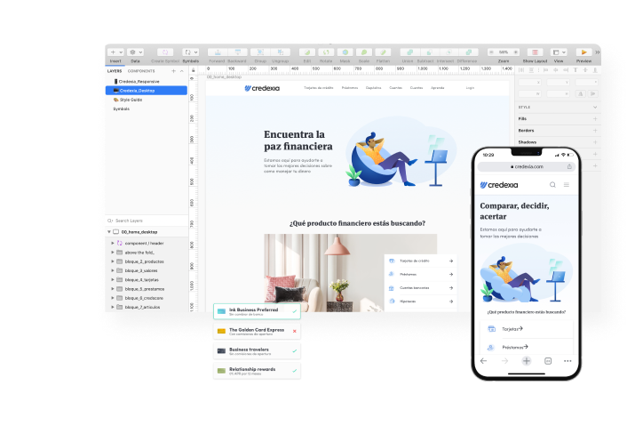
We can carry out any web design project
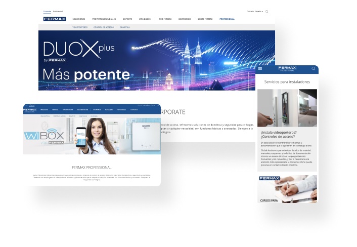
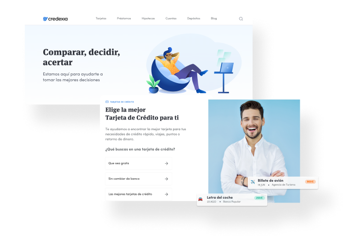
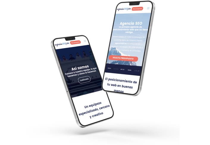
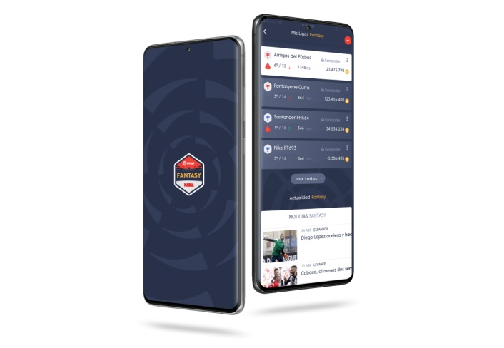
At Yeeply, we’ve designed many custom websites. These are just a few popular examples but we can certainly help you realise your web idea too.
Custom web design
Template web design
Redesign of a website
UX optimisation
Or whatever you need!
Website design with Yeeply: step-by-step
You’re only four steps away from getting your web design project off the ground. Shall we get started?
1. Tell us about your web design project
Describe what you need and provide as much information as possible.
2. We find you the perfect team
Our algorithm takes care of finding the right team to design your website.
3. Receive a custom quote
Obtain one or more personalised proposals. Negotiate with your team and sign when everything is clear.
4. Let’s design that website!
We take care of the paperwork so you can focus on the execution of the project.
We connect you with top-notch web designers to help you out
Discover more
5. Stages of your website’s design process
Now that you are acquainted with which professionals are involved in website design and know—among other useful information—where to find the team that suits you best, it is high time to tackle your website’s design process.
Traditionally, a website’s design process used to follow a linear approach. Nowadays, thanks to agile methodologies, an accomplished and well-coordinated team can make progress on several design aspects simultaneously or even work in parallel with the developers.
5.1 Sitemap: defining your website’s architecture
Website architecture is fundamental when it comes to user experience. And website design should focus on making user navigation easier while meeting the site’s objectives (user registration, downloads, sales, etc.). Some tips that may come in handy to achieve this:
- Having an accessible and simple menu. A website’s menu is its main navigation element, so we suggest you apply here a “less is more” approach. Forget about gargantuan menus with drop-down submenus. Select your website’s most relevant sections and, if possible, highlight the CTA of the section’s main objective next to the menu. This will help direct the user towards the main action that you expect him/her to make.
- Including a visible internal search engine. If a user needs to find something that is not easily findable at first glance, ensure he/she can turn to a search engine effortlessly. Make this option available so users may find what they are looking for as quickly as possible.
- Making it easy for the user. Like the devil, good design is in the details too. If your website includes a sign-up process, minimise its steps or create a progress bar that tells the user how much he/she has advanced regarding the process. In all your website’s forms, include only fields that are essential and make sure that all their elements are operative on any device (drop-downs, date pickers, and the like).
5.2 Wireframes: defining the structure of your website’s sections
Wireframes are the first design sketch of each of the website’s sections. They establish its structure and the main elements in its navigation (buttons, menus, icons, arrows, drop-downs, etc.).
Wireframes do not go into detail regarding content or design but are a starting point for all that will be developed later on. User experience is the most important thing at this point in website design. In other words, the most important aspect now is the distribution of the website’s content and navigation elements in a way that makes user interaction with the site easy.
Also, do not forget about multi-device access. Wireframes must be carried out for different kinds of screens to ensure that user experience is not affected by the use of different devices.
5.3 Mock-ups: working on your website’s visual aspect
Compared with wireframes, mock-ups go yet one step further. The moment has come to breathe life into the schemes that you have previously defined in the wireframes.
We will now be creating a static image of how the design of each of the website’s sections will look like. We will also be addressing key details such as its colours, navigation elements, menus, button CTAs, letter fonts and sizes, etc.
It’s also the appropriate time to define a style guide that will be useful for the entire website design process and convey a sense of continuity to its design—or even render the future design of new sections with the same visual identity easier. You can include in it indications concerning the colour palette, fonts, button design style, CTAs, symbols, icons, and so on.
5.4 Responsive web design: building your website for all devices
Website design has been focusing on desktop access for a long time but that is a thing of the past. Mobile devices are currently the most common way to access Internet sites. Therefore, the design must ensure the site’s user-friendliness on all screen sizes.
Furthermore, “mobile-first” design goes all the way to even having an impact on SEO positioning, as Google’s search results give priority to sites offering a good user experience on mobile phones. Here are some tips on responsive website design:
- Optimise fonts. Make sure your website’s fonts are displayed with an adequate size (not too big, not too small), even when being accessed from a small screen.
- Adjust image size. You should check that the website’s scale responds to the screen’s size and gets reframed. Images should never overflow the screen and force users to scroll to the sides.
- Adjust the menu. Check that your menu looks good on mobile devices and, if necessary, reduce the number of sections by maintaining only the most relevant ones. Easing one-handed navigation is the best trend to follow. To do so, adjust your website’s mobile design so that its menu is displayed on the lower area of the screen and leave the menu on the top only in its desktop version.
- Get rid of annoying items. Pop-ups rank high among the most hated items by users. However, if you opt for displaying one, make sure it is non-invasive and does not hinder user navigation on small screens. Some of them are hard to display correctly on mobile phones and difficult to close. This can result in users leaving your website.
5.5 Getting started with the technical stages of your website’s development process
Is your responsive website design set to go? If you are already satisfied with your website’s new appearance, it is about time for the most exciting part: making it a reality. A front-end developer will be in charge of transforming the mock-up designs to HTML, CSS, and JavaScript while a back-end developer will take care of the programming.
It may also be the case that you are working with a team of professionals that covers both design and development. In such a case, the development stage may begin perhaps even before the design stage is over: as we have seen before, processes are not always linear with agile methodologies.
Having your new website ready is closer than ever!
4. Custom website design vs using website templates
Your website’s design may either be customised or based on a pre-designed template depending on what kind of website you have in mind, its aim, and your budget. We will have a look at what these two options are exactly and the advantages entailed by each one of them.
4.1 Personalised or custom website design
Custom website design involves generating a website from scratch to deliver exactly what the client had in mind. This enables deploying a design that’s entirely adjusted to your corporate image and differentiates itself from that of other websites.
In general, this kind of websites offer a better user experience and generally have shorter loading times than those based on templates.
On the downside, their main disadvantage is the higher price of designs that are 100% original along with the longer amount of time they require. However, do not hesitate to go ahead with a custom design if it falls within your budget. The difference will stand out.
4.2 Website design using templates
Another option is to settle on a website design based on a predefined template. If you plan to use a CMS (Content Management System) such as WordPress for your website, remember that there’s no shortage of templates with predefined designs. This will allow you to have your website’s design ready in record time.
Buying a quality template is infinitely cheaper than having your website being designed from scratch. It is, therefore, a good option for the tightest budgets and doesn’t necessarily entail a worse or lower quality result than that of custom design.
Please, bear in mind that these templates can be modified but do not enable total customisation. Nevertheless, they are a perfectly valid option if your timing is also tight and you want an MVP (Minimum Viable Product) ready as soon as possible.
3. What is the cost of creating a website?
If you have come this far looking for the exact cost of designing a website, we’re sorry to tell you that it will depend. It is impossible to give a fixed and standard price for website design in general because multiple variables are coming into play in every different project.
This is the reason why we always suggest requesting a personalised quote based on your project’s characteristics. However, we can take a quick look at which factors affect the cost of website design. Let’s find out!
3.1 Aspects that have an impact on the price of website design
- Do you want to redesign an already existing website or would you rather have it designed from scratch? These are two completely different options, as designing a website from scratch has little to do with updating the visual identity of one that already exists.
- Must your website have a unique design or will a template-based design suffice? It may go without saying but let’s remember that exclusivity always comes at a price. You will have to go for an exclusive website design if you want to add something new to your business that will make an impression. However, if you seek a professional result and your budget is tighter, the best solution may be to adapt an existing template. Also bear in mind that, in this case, the project can be carried out in less time.
- How many sections must be designed? The number of sections and graphic elements to be designed also affects the website’s final design price.
- What kind of graphic elements do you want to include on your website? The latest trends in website design are committed to including illustrations and other animated elements that promote user interaction. This can take a toll on its cost, especially in extensive website design projects.
3.2 Website design mistakes you must avoid to save costs
- Copying design trends. Whether you are redesigning your website or kicking off a brand new project, you will probably have done some research on current trends and are looking for something up-to-date as to its design. However, inspiration is one thing and copying is another. Making a carbon copy of another website will make yours unremarkable and you will miss the opportunity of making an impression on your visitors.
- Using images of poor quality. A website design desiring to look professional cannot afford including pixelated or distorted images or illustrations. Likewise, if your budget is not enough to commission original illustrations and you must resort to image banks, please stay clear of free, low-quality image banks. Their graphic resources leave much to be desired and usually have also been overused, some even have become clichés.
- Having an inappropriate colour palette. Setting aesthetics aside, an inappropriate colour palette can also ruin the website’s user experience despite being properly designed as far as all other matters are concerned. A bad colour combination can bring about poor contrast between the texts and their background, resulting in poor legibility.
- Including hardly readable fonts. Along the same lines, the website should only use easily readable fonts. Please bear in mind that your website’s design must also envisage touch-screen browsing, so fonts with bizarre shapes are not recommended at all. It is best to pick sans-serif fonts for headlines and serif fonts for texts.
- Including too much text. Having endless blocks of text results in poor user experience. Keep in mind that your visitor’s time is at least as valuable as yours. Therefore, your website’s design must help him/her find the information they are looking for straight away. Organising your website’s content adequately and highlighting the most relevant information is essential to achieve this and ensure good user experience.
- Offering complex navigation. Researching your target user’s profile while taking into account your website’s aim will reveal which is the best way to structure its content and simplify its navigation. Getting this UX designer task not properly set up may result in having the website’s contents structured illogically and users leaving it because they cannot find what they are looking for.
2. Where to find the right web design team
Now that you are acquainted with the differences between UX, UI, and graphic web designers, it is time to have a look at how to find the best website design team for your project.
2.1 Technology marketplace
A technology marketplace like Yeeply is the ideal option if you want to find the best website design professionals for your project but you don’t have much time to spare on this search. Do you want to find out how to save time and money?
- Tell us more about your project. You just have to get in touch with us and let us know the basic details concerning your web design project.
- Once you have given us this information, we will put our algorithm to work until we find the professional profiles that are the best match with what you are looking for.
- Yeeply will then send you one or more proposals so that you can assess them and pick the one you like the most.
Before agreeing, we will always be available to resolve any possible doubts you may have regarding the project.
Yeeply will take care of everything so that you can devote yourself to your regular work during the team searching process. Once an agreement has been signed, we will accompany you throughout the entire development process to ensure that your website is designed as you had in mind sooner than you imagine.
Easy, simple and hassle-free!
2.2 Website design company or agency
If you require several design-related professional profiles, turning to a web design agency may prove a good option. Virtually all cities have a myriad of web design companies addressing all kinds of website styles and projects. On top of that, borders no longer exist nowadays as far as business is concerned and working with a website design company remotely is quite common.
However, along this endless variety comes harder choice-making. You must take into account the amount of time you’ll have to spend searching for the agency that suits your project best and has experience in projects similar to yours. Also, if it is a popular agency, it may not be available to design your website within the deadlines you are considering.
2.3 Freelance website designer
There are different technology portals where you can look for freelance website designers. Some of these portals work like a search engine giving you back results based on which professional profile you are looking for and your preferred location. Others require you first publish a job offer with your project and freelancers will then submit their quotes for you to pick among them who will carry it out.
In both cases, you should review the portfolios and proposals you receive and take the time to select the profiles that you find more interesting. This involves spending a lot of time on searching both profiles and references. Therefore, it may not be the best option if your deadline to get your website design project done is tight.
2.4 How to pick the right professional
You may harbour some doubts as to whether you will be getting the right professional or design team—this being especially true when you lack experience with technological projects. For this reason, we’ll now discuss some of the main aspects you should be looking for before deciding which team is the most suitable one for designing your website.
- The quote submitted falls within my price range. It often happens that the budget is fixed and can not be bargained upon. It is, therefore, essential to be able to find freelancers or website design agencies that fit in well with your budget. Also, make sure to find out if there are going to be extras of any kind that could increase the final price or if, on the contrary, the quote submitted is a fixed quote.
- The selected partner can meet the delivery deadlines. Sometimes the project has fixed deadlines that cannot be altered. Therefore, it’s important to ensure that the partner selected can meet these delivery deadlines smoothly.
- The selected partner’s style befits your project. Beyond references, it is important to review the professional’s or web design agency’s portfolio to check that you like its style and that it fits in well with what you need. Making a poor choice can lead to misunderstandings, disagreements, and delays regarding the deadlines you may have already set.
- The selected partner has experience in website design. It is utterly important that you are satisfied with your web’s design but it must not slip your mind that this design will then go ahead onto the website’s subsequent development phase and be handled by programmers. Do not be left wondering about it: make sure the partner you select has a solid background in web design rather than just in graphic design in general, as many professionals with that profile lack knowledge on that.
1. Professional profiles required to design your website
Website design involves different professional profiles—each of them taking care of a different area. Sometimes a single person can take on the entire design process, especially when it comes to small projects with a small budget.
It is common to get some of the tasks related to each of these different professional profiles mixed up. Let’s, thus, have a look at the roles associated with each of them.
1.1 Graphic designer
Graphic web designers are responsible for the visual aspects of the website’s design process. Choosing the colour palette and letter fonts, designing banners and picking images… These are all tasks that fall within the typical duties of the web’s graphic designer.
His/her work is aimed at ensuring that the website has certain visual coherence so users may perceive a sense of continuity when browsing it. Besides, the graphic designer’s work will be a sort of groundwork as to colours, images, logos, and letter fonts and sizes that will govern the UI designer’s work.
1.2 UX designer
User experience design (UX design) encompasses everything related to the user’s interaction with a website’s or an app’s design.
Good UX design is achieved when users are left with a good feeling after having interacted with the website. Bad user experience can give rise to users perceiving the product or service offered as being of poor quality as a result of such interaction; hence the importance of the UX designer.
UX and UI design get often mixed up despite being two easily-distinguishable separate areas. UX involves analytical and investigative tasks intending to offer a good user experience. Typical UX designer functions include target user profile research, prototyping, or task flows. On the other hand, UI design affects the website’s visual aspects and entails a greater creative component.
1.3 UI designer
The user interface consists of all the elements that have been conceived to enable users to navigate and interact with the website. These elements are menus, buttons, arrows, scroll bars, etc.
It may sometimes be tempting to innovate in website navigation but the truth is that you can not afford to stray out from certain conventions that allow users to move around or perform certain actions intuitively.
We must not overlook the fact that our prime goal here is to offer a high level of user-friendliness and make website navigation as easy as possible. Anything that results in users having to spend time on learning how to perform common actions on the website makes no sense design-wise.
Therefore, when designing the user interface, the UI designer will generally stick to the guidelines that have been set out by the UX designer. These guidelines will hold sway over aspects of user interface design such as how active links are highlighted, how micro-interactions are designed, the possibility of cycling images around like in a carousel, or how a button’s colour changes when hovering over it.

